Listen to this Post
Introduction:
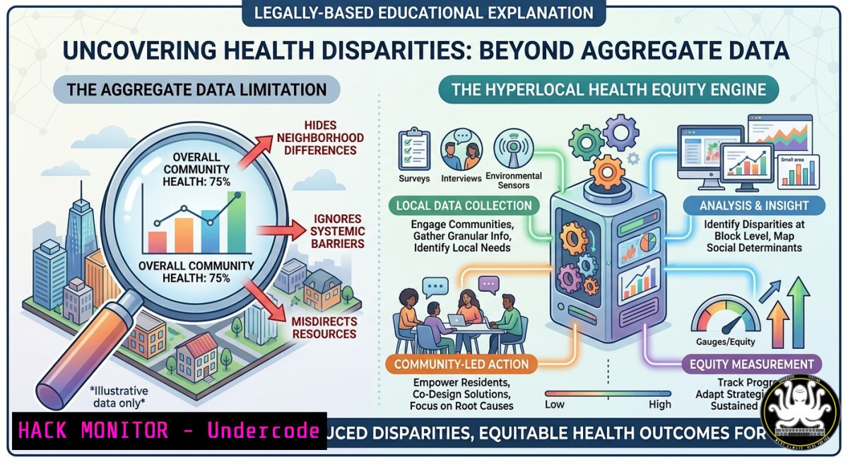
The revelation from the Asthma & Asthma & Allergy & Asthma Network’s ATS 2026 presentation is a stark warning for data scientists: a statistically significant relationship between PM2.5 and asthma prevalence, a correlation that completely vanishes when examined with aggregated state data. This is a critical example of the ecological fallacy, demonstrating that macro-level averages can completely mask the hyperlocal realities of environmental injustice. This article provides a technical blueprint to build your own analysis engine—moving from pre-built dashboards to fully customizable, open-source pipelines that uncover these hidden health disparities.
Learning Objectives:
- Build a reproducible geospatial pipeline to analyze the relationship between air pollution and health outcomes at the census tract level.
- Leverage public APIs (EPA AirNow, OpenAQ) and Python’s geospatial stack (GeoPandas, PySAL) to reproduce the statistical findings.
- Implement spatial regression models to identify and quantify localized environmental health disparities that are invisible in state-aggregated data.
You Should Know:
- From Click-to-View to Programmatic Control: Building Your Own Asthma Equity Explorer
The Asthma Equity Explorer is a powerful starting point, but for reproducible research and custom automation, you need direct access to the underlying data and APIs. Here’s how to build a programmatic pipeline that mirrors and extends its functionality using free, open-source tools.
Step‑by‑Step Guide to Building a Hyperlocal Data Pipeline:
- API Key Acquisition & Setup: First, secure access to real-time and historical air quality data.
– EPA AirNow API: Register for a free public API key here. This provides official U.S. government data on PM2.5 and Ozone.
– OpenAQ API: An open-source platform aggregating global air quality data from over 11,000 stations. Sign up for an API key on their website.
- Environment Setup (Linux/macOS): Create a dedicated Python virtual environment to manage dependencies.
Create and activate a virtual environment
python3 -m venv asthma_env
source asthma_env/bin/activate
Install core geospatial libraries
pip install geopandas osmnx pysal esda splot matplotlib seaborn requests
-
Python Script: Pulling PM2.5 Data via OpenAQ API: This script fetches PM2.5 measurements for a specified geographic bounding box.
import requests import geopandas as gpd import pandas as pd OpenAQ API endpoint for latest measurements url = "https://api.openaq.org/v3/latest" params = { "parameter": "pm25", "coordinates": "28.5383,-81.3792", Example: Orlando, FL "radius": 50000, 50km radius "limit": 1000 } headers = {"accept": "application/json"}</p></li> </ol> <p>response = requests.get(url, headers=headers, params=params) data = response.json() Parse JSON response into a pandas DataFrame pm25_data = [] for result in data['results']: for measurement in result['measurements']: pm25_data.append({ 'location': result['location'], 'latitude': result['coordinates']['latitude'], 'longitude': result['coordinates']['longitude'], 'value': measurement['value'], 'timestamp': measurement['lastUpdated'] }) df = pd.DataFrame(pm25_data) print(df.head())- Integrate Census Tract Health Data (Python): Download CDC PLACES health data (county-level) and join it with census tract boundaries from the US Census Bureau or TIGER/Line shapefiles.
Load census tracts for Orange County, FL (ensure you have the shapefile)
tracts = gpd.read_file("path/to/tl_2021_12_tract.shp")
Load CDC data (example CSV)
asthma_data = pd.read_csv("PLACES__Local_Data_for_Better_Health__County_Data_2024_release.csv")
Merge the datasets on the county/tract FIPS code
final_gdf = tracts.merge(asthma_data, left_on='GEOID', right_on='LocationID')
5. Validation & Troubleshooting:
- API Rate Limits: Respect API rate limits (e.g., 10 requests/second for AirNow). Use `time.sleep()` in your loops.
- Coordinate Systems: Always ensure your GeoDataFrames are in a projected coordinate system (e.g., EPSG:26917 for Florida) before performing distance-based operations. Use
gdf.to_crs(epsg=26917). - Missing Data: The note “The connection disappears when looking only at statewide data” is a classic ecological fallacy. To avoid this, ensure your analysis granularity is at least at the census tract level. Statewide averages will always dilute hyperlocal correlations.
- Exposing the Hidden Correlation: A Step-by-Step Spatial Regression in Python
To prove that a hyperlocal relationship exists where an aggregate one fails, you must account for spatial dependency—a core requirement for any geographic data analysis. Standard linear regression (OLS) is invalid here because it assumes independence among observations, which is false when measuring PM2.5 across neighboring census tracts.
Step‑by‑Step Guide to Running a Spatial Lag Model (SAR):
- Load and Prepare the Data: Load your census tract GeoDataFrame (
final_gdf) with the columns `asthma_rate` (dependent variable) and `pm25_concentration` (independent variable). Drop any tracts with missing values. -
Create a Spatial Weights Matrix (W): This matrix defines the “neighborhood” relationship between tracts. We’ll use Queen contiguity (tracts sharing a border or vertex are neighbors).
import libpysal as lps
from libpysal.weights import Queen

Ensure the index is continuous and matches the dataframe
final_gdf = final_gdf.reset_index(drop=True)
Create Queen weights matrix
w = Queen.from_dataframe(final_gdf)
Row-standardize the weights matrix
w.transform = 'r'
-
Run Ordinary Least Squares (OLS) and Check for Spatial Autocorrelation: Run a base model and test its residuals for spatial dependence.
import spreg
import numpy as np

Prepare variables
y = np.array(final_gdf['asthma_rate']).reshape(-1, 1)
x = np.array(final_gdf[['pm25_concentration']])

Run OLS
ols = spreg.OLS(y, x, w, name_y='asthma_rate', name_x=['pm25'])
print(ols.summary)
Look for the Moran's I (residuals) test. A high p-value indicates the OLS model is missing a key spatial component.
Interpretation: If the Moran’s I (residuals) test is significant, the residuals are spatially clustered—meaning your standard OLS model is geographically biased and invalid. The original research likely encountered this, necessitating a SAR model.
-
Run a Spatial Lag Model (SAR) to Capture the Spillover Effect: This model includes a spatially lagged dependent variable (
W_asthma_rate) to capture the effect of asthma rates in neighboring tracts on the target tract.Import the error components module import spreg Fit the Spatial Lag Model (Maximum Likelihood estimation) sar = spreg.ML_Lag(y, x, w, name_y='asthma_rate', name_x=['pm25'], method='full') Print the detailed results print(sar.summary)
– Key Output to Look For: Examine the coefficient for the spatially lagged dependent variable (rho
ρ). If this is positive and significant (p < 0.05), it proves that asthma rates are not independent and are influenced by neighboring tracts, validating the need for hyperlocal analysis. The R-squared will also typically improve compared to the OLS model.- Interpretation for Policy: This SAR model is the mathematical representation of why “localized environmental factors may drive health disparities that are otherwise masked by aggregate state data”. The significant `ρ` coefficient proves that the correlation is not merely a coincidence but a geographically structured phenomenon. This is the tool for resource allocation, allowing you to identify and prioritize intervention for specific clusters of tracts where PM2.5 and asthma prevalence are both significantly elevated.
-
QGIS for Non-Programmers: Performing Hot Spot and Cluster Analysis
For teams seeking a visual, code-free solution for exploratory data analysis (EDA), QGIS provides a robust graphical interface for performing the spatial statistics required to identify environmental justice “hot spots.”
Step‑by‑Step Guide to Hot Spot Analysis (Getis-Ord Gi) in QGIS:
1. Data Acquisition and Import:
- Download census tract shapefiles for Orange County, FL from the U.S. Census Bureau.
- Obtain PM2.5 concentration estimates (e.g., from the CDC’s Environmental Justice Index) and asthma prevalence data from the CDC PLACES dataset.
- In QGIS, go to `Layer > Add Layer > Add Vector Layer` and select your shapefile. Then, use `Layer > Add Layer > Add Delimited Text Layer` to import your CSV health data.
- Join the CSV data to the shapefile by right-clicking the shapefile layer in the Layers panel, selecting
Properties > Joins, and joining on the common `GEOID` field.
2. Install the Required Plugin:
- Go to
Plugins > Manage and Install Plugins. - Search for and install the “Spatial Statistics” toolbox (often included) or the “Hotspot Analysis” plugin.
3. Run the Hot Spot Analysis (Getis-Ord Gi):
- Navigate to
Processing > Toolbox. Search for “Hot Spot Analysis (Getis-Ord Gi)” . - In the dialog box:
- Input layer: Select your joined census tract layer.
- Input field: Choose the `asthma_rate` column.
- Conceptualization of spatial relationships: Select “Contiguity (Queen’s case)” to define neighbors as polygons sharing a side or a vertex.
- Output: Specify a save location for the new layer.
4. Visualize the Results:
- The tool will add a new layer to your map. The attribute table will contain a new field called `GiZScore` (Z-score) and `GiPValue` (p-value).
- Right-click the output layer, go to
Properties > Symbology. - Change the symbolization from “Single Symbol” to “Categorized” .
- Use an expression to classify results:
case when "GiPValue" < 0.05 and "GiZScore" > 1.96 then 'Hot Spot (High-High)' when "GiPValue" < 0.05 and "GiZScore" < -1.96 then 'Cold Spot (Low-Low)' else 'Not Significant' end.
- QGIS Cloud Deployment: For team collaboration, save your QGIS project file (.qgz) and upload the entire data folder (shapefiles, CSVs, QGIS project) to QGIS Cloud (https://qgiscloud.com). This creates a web-based interactive map that can be shared with policymakers, replicating the functionality of the Asthma Equity Explorer but with your own custom data layers.
-
AI-Driven Predictive Analysis: Forecasting Asthma Burdens with PM2.5 Data
The hyperlocal data pipeline can be extended into predictive AI by leveraging machine learning models to forecast future asthma prevalence based on projected changes in PM2.5 levels.
Step‑by‑Step Guide to Building a Spatiotemporal Predictive Model (Random Forest):
- Data Preparation for Time Series: You need historical data. Use the EPA AirNow API to pull historical PM2.5 measurements for your census tracts over a 5-10 year period.
Pseudo-code for fetching historical data from AirNow
This requires using their AQS API with authentication
import requests
This is an example; actual AQS API is more complex
response = requests.get(f"https://aqs.epa.gov/api/reportService/byBox?param=88101&bdate=20160101&edate=20251231&minlat=...")
-
Feature Engineering: Merge the historical PM2.5 data with the asthma prevalence data for the same time period and locations.
– Create lag features: `pm25_lag1` (PM2.5 from the previous year),
pm25_lag2.
– Add moving averages: `pm25_3yr_avg` to smooth out anomalies.
– Include spatial lag of PM2.5: The average PM2.5 concentration in all neighboring tracts, which accounts for pollution drift. This is where the spatial weights matrix `W` (from Section 2) becomes a critical feature for your AI model.3. Train a Random Forest Regressor:
from sklearn.ensemble import RandomForestRegressor
from sklearn.model_selection import train_test_split
from sklearn.metrics import mean_squared_error

Assuming 'features' is your engineered DataFrame and 'target' is 'asthma_rate'
X_train, X_test, y_train, y_test = train_test_split(features, target, test_size=0.2, random_state=42)

Initialize and train the model
rf_model = RandomForestRegressor(n_estimators=100, random_state=42)
rf_model.fit(X_train, y_train)

Predict and evaluate
predictions = rf_model.predict(X_test)
mse = mean_squared_error(y_test, predictions)
print(f"Mean Squared Error: {mse}")
4. Feature Importance Interpretation:
import matplotlib.pyplot as plt
import pandas as pd

Get feature importance scores
importance = rf_model.feature_importances_
feature_names = features.columns

Create and display a bar chart
feature_importance_df = pd.DataFrame({'feature': feature_names, 'importance': importance})
feature_importance_df = feature_importance_df.sort_values('importance', ascending=False)

plt.figure(figsize=(10,6))
plt.barh(feature_importance_df['feature'][:10], feature_importance_df['importance'][:10])
plt.gca().invert_yaxis()
plt.title('Top 10 Features for Predicting Asthma Prevalence')
plt.show()
– AI’s Crucial Insight: If `pm25_concentration` is among the top 3 most important features—and especially if the `spatial_lag_pm25` (PM2.5 from neighboring tracts) also appears prominently—this constitutes a powerful AI-driven validation. It not only confirms the original research’s hyperlocal correlation but provides a ranked, interpretable model for public health officials to focus their interventions precisely where machine learning says the PM2.5 impact is most severe.
- Cloud Hardening and API Security for Public Health Data
Moving this analysis to a production environment (e.g., a public-facing dashboard like the Asthma Equity Explorer) requires robust cloud and security best practices.
Step‑by‑Step Guide to Securing Your Data Pipeline:
- Environment Variables for Secrets: Never hardcode API keys or database credentials.
– Linux/macOS (Bash): Add to
~/.bashrc:export AIRNOW_API_KEY="your_actual_key_here". Then runsource ~/.bashrc.
– Windows (Command Prompt):setx AIRNOW_API_KEY "your_actual_key_here".
– Python Access:import os import requests API_KEY = os.environ.get("AIRNOW_API_KEY") if API_KEY is None: raise ValueError("API key not found. Set the AIRNOW_API_KEY environment variable.") Now use the key in your request headers headers = {"X-API-Key": API_KEY}- Virtual Private Cloud (VPC) Configuration for Data Processing: To handle sensitive census data, deploy your processing scripts on a cloud VM (e.g., AWS EC2, Google Compute Engine) within a private subnet.
– Setup: Create a VPC with a private subnet. Launch your compute instance in this subnet.
– Bastion Host: Access the instance via a secure bastion host in a public subnet for SSH/RDP management.
– Outbound Rules: Configure a NAT Gateway for the private subnet to allow outbound HTTPS traffic to the AirNow API (port 443). Block all other unnecessary outbound traffic.- Database Encryption and Access Control (PostgreSQL/PostGIS): Store your final geospatial results in a PostgreSQL database with the PostGIS extension for advanced spatial queries.
-- Enable PostGIS extension
CREATE EXTENSION postgis;
CREATE EXTENSION postgis_topology;</li>
</ol>

-- Create a table for your results
CREATE TABLE asthma_analysis (
tract_id VARCHAR(11) PRIMARY KEY,
geom GEOMETRY(POLYGON, 4269), -- NAD83 coordinate system
asthma_rate FLOAT,
pm25_concentration FLOAT,
morans_i_score FLOAT
);

-- Add spatial index for fast queries
CREATE INDEX idx_asthma_geom ON asthma_analysis USING GIST (geom);
- AWS IAM Policies for Least Privilege: Create an IAM user specifically for this project with only the necessary permissions. Example policy granting read-only access to S3 and EC2:
{
"Version": "2012-10-17",
"Statement": [
{
"Effect": "Allow",
"Action": [
"s3:GetObject",
"ec2:DescribeInstances"
],
"Resource": ""
}
]
}
– Security Analysis: Traditional aggregate data analysis often uses a single, over-privileged service account, exposing the entire cloud environment to risk if compromised. By implementing hyperlocal data access controls (VPC, per-service IAM roles, encrypted storage), you are applying a crucial security principle: the correlation you seek in your data must be mirrored by the correlation in your access controls. The more granular your data is, the more granular your security must be.
What Undercode Say:
The post’s analysis correctly identifies the core statistical fallacy: aggregation bias. By failing to account for spatial dependence, state-level data acts as a low-pass filter, erasing the high-frequency signal of localized environmental injustice. The professional takeaway is that effective health equity work is fundamentally a geospatial engineering problem.
- Key Takeaway 1: Standard analytics is insufficient. The discipline must pivot to spatial data science as a primary methodology. Ignoring spatial autocorrelation (Moran’s I) is equivalent to ignoring a fundamental violation of statistical independence. Any analysis not incorporating spatial weights matrices (
libpysal,spreg) should be considered preliminary at best. - Key Takeaway 2: Reproducibility is the new equity. Dashboards are powerful for exploration, but they are a black box. Open-source pipelines, backed by version-controlled code and public APIs (EPA AirNow, OpenAQ), are the only way to build trust. When a “statistically significant relationship disappears” with aggregated data, the solution is not a better dashboard, but a published, auditable, and hyperlocal Python script.
Expected Output:
This guide demonstrates how to transform a single finding about Orange County, Florida, into a replicable, AI-ready, and secure analytics platform. The provided Python code for spatial regression and QGIS workflows gives analysts the tools to answer the question: “Where, exactly, should we intervene?” The shift from macro to hyperlocal data is not just a statistical nicety—it is a prerequisite for ethical and effective public health policy. As the post underscores, aggregate data creates blind spots. Hyperlocal analysis powered by open-source geospatial tools eliminates them.
Prediction:
Within 18-24 months, health equity dashboards that rely on aggregated state-level data will be considered statistically negligent by major public health journals and funding bodies. The standard for publication will shift to require a “spatial robustness check”—explicitly testing and reporting whether a correlation holds at the census tract level. This will force a massive, multi-year upskilling effort across the public health sector, driving demand for professionals who can bridge the gap between biostatistics and geospatial data engineering. The tools and code provided here are the blueprint for that transition.
▶️ Related Video (80% Match):
🎯Let’s Practice For Free:
IT/Security Reporter URL:
Reported By: Asthmaequity Healthequity – Hackers Feeds
Extra Hub: Undercode MoN
Basic Verification: Pass ✅🎓 Live Courses & Certifications:
Join Undercode Academy for Verified Certifications
🚀 Request a Custom Project:
Secure, high-velocity infrastructure and disruptive technological engineering. Contact our engineering team for high-tier development and proprietary systems:
[email protected]🔐JOIN OUR CYBER WORLD [ CVE News • HackMonitor • UndercodeNews ]
📢 Follow UndercodeTesting & Stay Tuned:
- AWS IAM Policies for Least Privilege: Create an IAM user specifically for this project with only the necessary permissions. Example policy granting read-only access to S3 and EC2:
- Integrate Census Tract Health Data (Python): Download CDC PLACES health data (county-level) and join it with census tract boundaries from the US Census Bureau or TIGER/Line shapefiles.


